Analytics & Phenotyping
Load per-object measurements from a CSV, color your segmentation by any column, filter objects by range or value, and build named phenotype groups to classify cell populations.
The short version: analytics lives inside a label. You load a table that maps object ID → measurements, and the viewer colors the label mask by any column. Everything you configure is per-label. Different labels can have different CSVs, different coloring, different phenotypes.
A worked example
HCS Analytics in the Browser: 18,648 Nuclei, Zero Uploads runs this whole flow on the BBBC013 screen, from segmentation output to named phenotypes. The screenshots on this page come from that same run.
Prerequisites
- A segmentation label loaded on the image (either embedded in the OME-Zarr or added via Add Local / Add URL).
- A table of per-object measurements whose object-ID column matches the label's pixel values. Most CellProfiler, FIJI and QuPath exports work as they come. See the Analytics Data Format for the full contract, and for hosting a whole analysis (masks included) behind one URL.
- Any browser, if you load from a URL. Picking a file from disk needs the File System Access API, which today means Chrome or Edge.
Loading a CSV
- Open the Labels tab and click a label row to expand its detail panel.
- Inside the expanded detail, find the ANALYTICS section.
- Click Load analytics file to pick a CSV or Parquet from disk, or Load from URL… to paste an address. Once something is loaded, Replace swaps it.
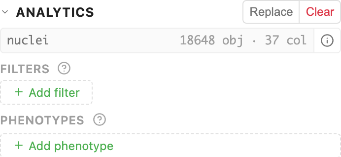
- The viewer parses it, profiles every column, and shows a summary:
filename · N obj · M col.
You never pick a format. Whichever way you came in, the viewer reads it off what you gave it: .parquet as Parquet, a trailing slash as an analysis directory, anything else as a delimited table. A directory is how one address brings masks and measurements together, and there is a shortcut for it: Add URL in the Labels toolbar attaches the masks and their analytics in one action, without expanding a label first.
Object-ID auto-detection
The viewer recognises the usual spellings of an object-ID column. One match and it uses it, several and it asks which, none and it falls back to row index, which matches the CellProfiler, FIJI and QuPath default exports. The recognised names are listed in the format guide, along with why that column decides whether anything lines up at all.
Inspecting the columns
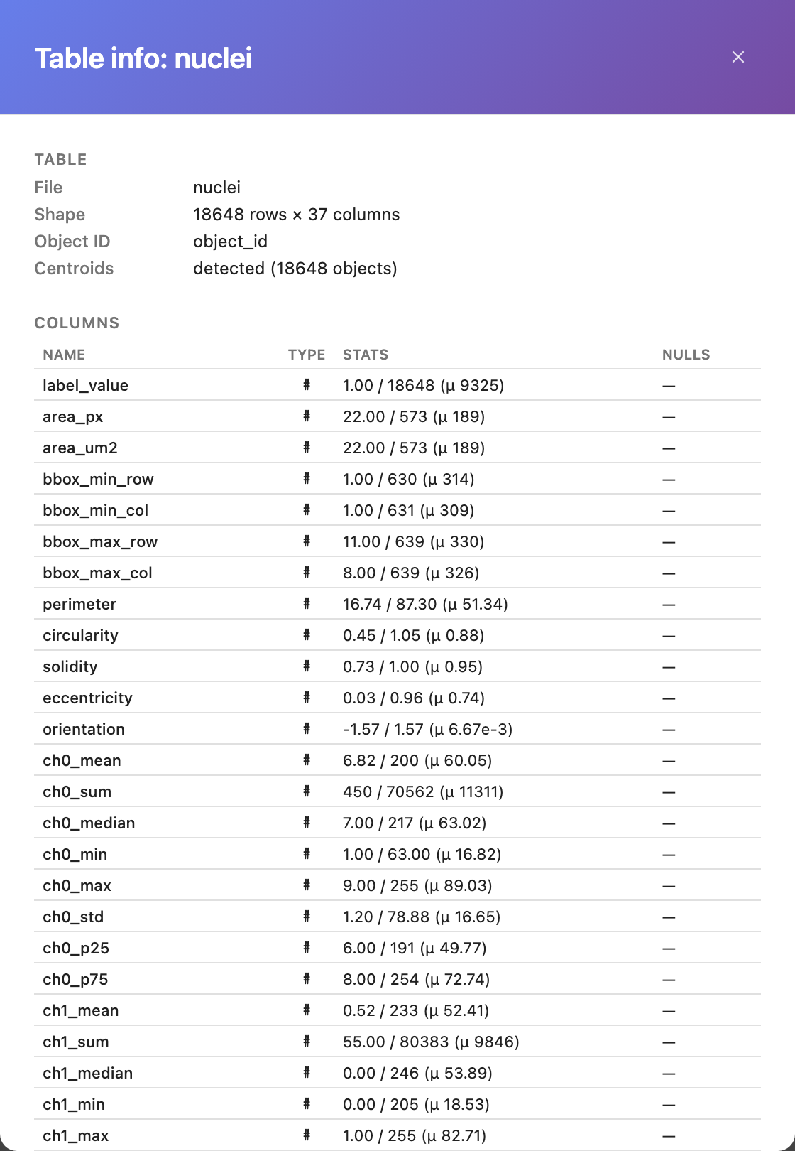
Click the  info button next to the filename to open a table summary:
- Numeric columns: min, max, mean, standard deviation, null count
- String columns: number of unique values (capped at 500)
- Detected object-ID column is flagged at the top.
File formats
CSV is the common path. Tab- and semicolon-delimited tables work too, and the parser detects the separator itself. Parquet is read column by column, so it stays usable at plate scale. When the table gets big covers the trade-off.
Color by column
With analytics loaded, open the label's color swatch popover (the coloured square on the label row). Three coloring modes become available:
- Solid: one color for everything (default, no analytics needed)
- Random: hash object ID → color (no analytics needed)
- Heatmap: numeric column → color ramp
- Category: string column → distinct color per value
Heatmap (numeric columns)
Pick a numeric column from the dropdown. The viewer colors every object on the canvas by its value along a scientific color ramp.
Available ramps:
- viridis: perceptually uniform, default, handles most data
- magma, inferno, plasma: darker low, brighter high
- coolwarm: diverging, useful for zero-centered measurements
- turbo: high-contrast rainbow
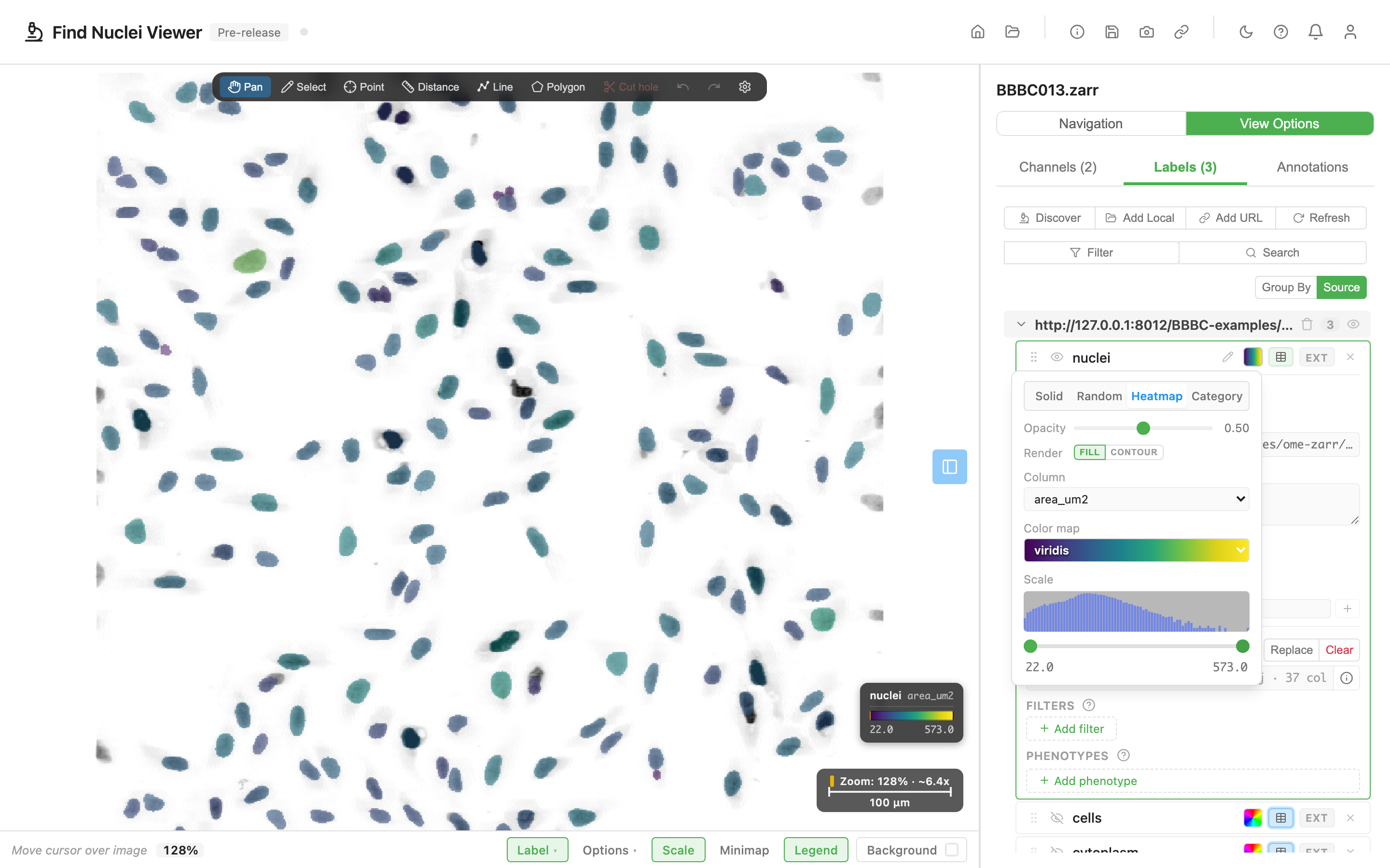
Below the column and ramp controls, a histogram of the column's values appears with a dual-range slider. Drag the handles to override the display min/max. Useful when a handful of outliers compress the interesting signal. The legend card reflects your override in real time.
Category (string columns)
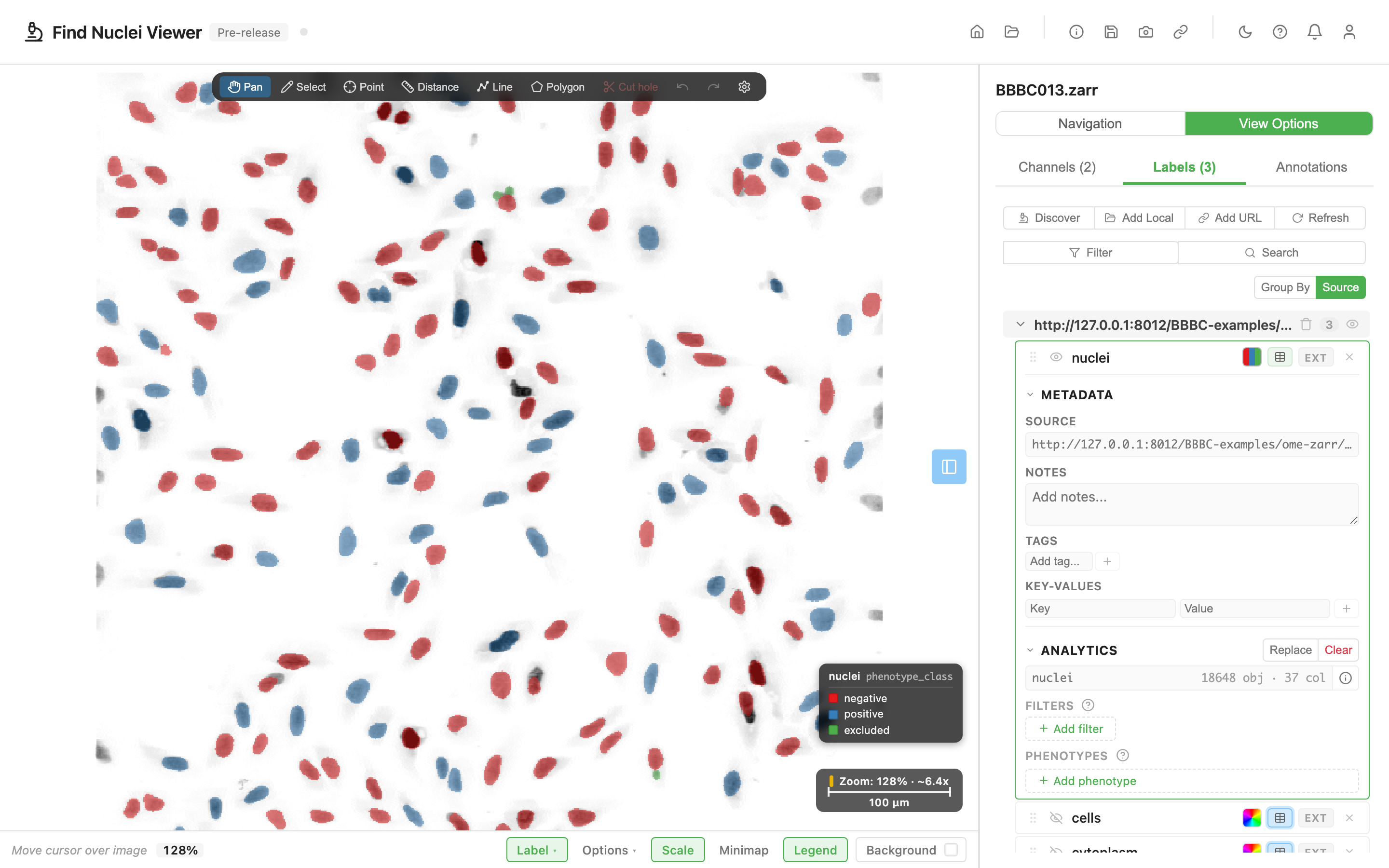
Pick a string column. Each unique value gets a distinct color from a deterministic palette (same value → same color across reloads). The canvas re-colors every object by its category, and a legend card below the scale bar lists color ■ value pairs.
The screenshot below uses a column called phenotype_class, written by the segmentation run that produced the labels. It holds one value per object: positive, negative or excluded. Nothing about it is special to the viewer. It is a string column like any other, and it is not the same thing as the Phenotypes feature further down this page. See Phenotype groups and class columns.
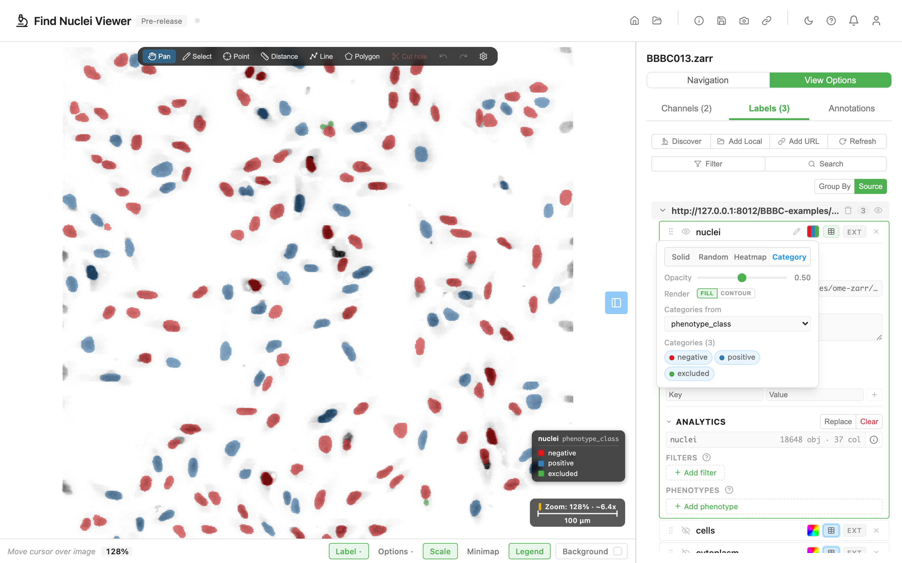
For columns with many unique values, the legend caps at 12 rows and shows "+N more".
Filters
Below the color-by section, a FILTERS panel hides objects that don't match your conditions. Filters don't change the coloring. They just remove non-matching objects from the canvas.
Click  Add filter and pick a column from the popover. The filter's UI depends on the column type:
- Numeric: histogram + dual-range slider. The range you pick is inclusive; objects outside it become invisible.
- String: checkbox grid of unique values, all selected by default. Uncheck the values you want to exclude.
Multiple filters compose with AND: an object must pass every active filter to stay visible. Each filter row has a remove control and a collapse control to hide its histogram when you want a compact view.
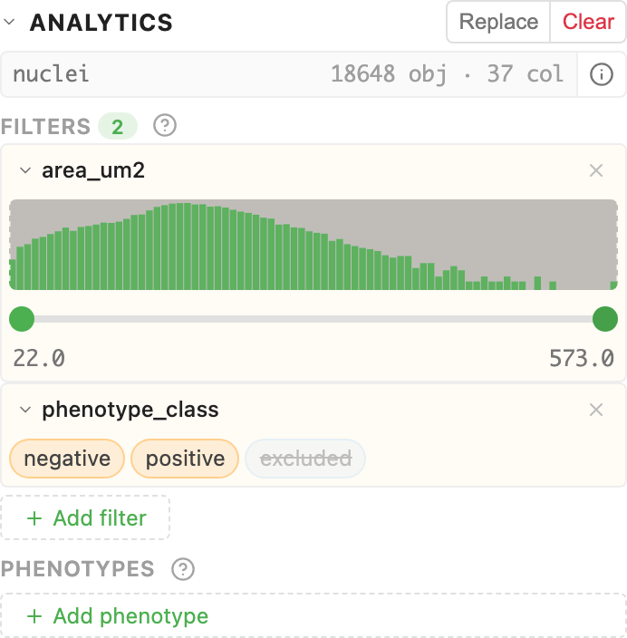
Filters are independent of coloring
You can color by area_px (heatmap) while filtering by is_mitotic (string). The two settings compose cleanly. Color reflects the data dimension you care about; filters remove the objects you don't.
Phenotypes
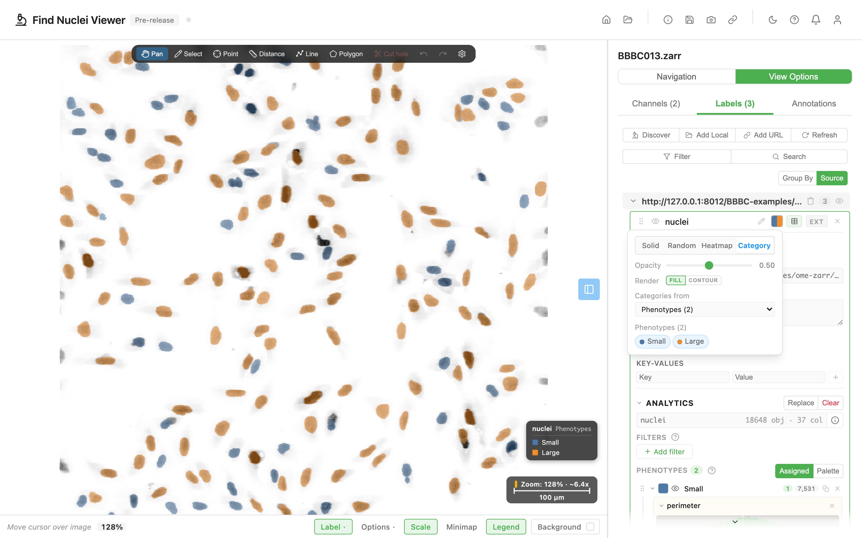
Two groups, Small and Large, split on nuclear perimeter. The colours on the image, the legend, the source dropdown and the group list all show the same two groups.
A phenotype is a named, coloured group of filter conditions. Think of it as a named bucket: "Small cells with high marker X", "Cells at the tumor-stroma boundary", "Cells that entered mitosis." Phenotypes compose on top of the same filter machinery above, but each phenotype has its own color, name, and visibility.
When at least one phenotype exists, the canvas switches to phenotype coloring: every object gets the color of the first phenotype it matches. Objects that match nothing show in gray (toggleable) or hide entirely.
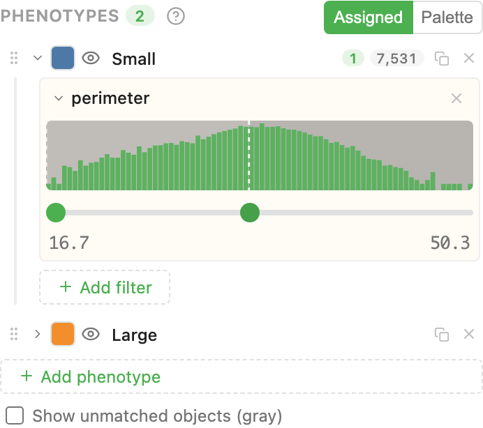
Creating a phenotype
Click Add phenotype. A new group appears with a default color, name, and no filters. Click the name to rename it. Click the swatch to pick a colour. Add filters inside the group the same way you add global filters. The difference: they belong to this group alone.
The first phenotype you create auto-flips the label's coloring to phenotype mode. You don't need to manually switch. The viewer assumes "you just created a phenotype, you probably want to see it."
Reordering (first-match-wins)
Phenotype groups evaluate top to bottom. The first group an object matches wins the color. If you have overlapping definitions, the order of groups matters.
Drag the grip handle on the left of each phenotype to reorder. Duplicate a group with the  copy icon if you need a similar one with slight tweaks. Filters and color copy over; the name gets "(copy)" appended.
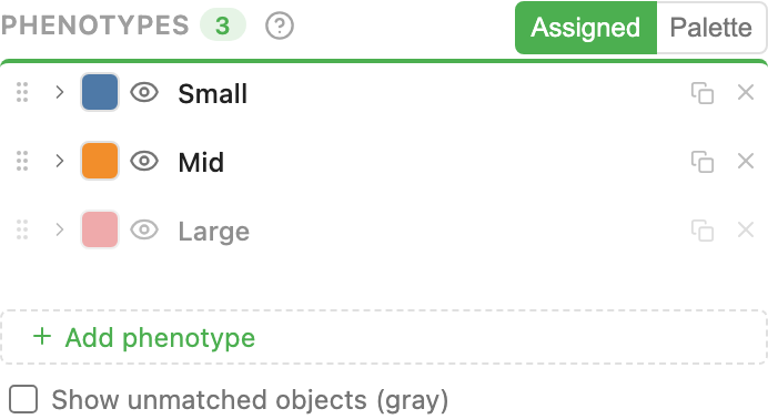
Show unmatched objects
A checkbox below the phenotype list: Show unmatched objects (gray). Objects that match no phenotype either:
- Render in gray (checkbox on): useful to see the full context
- Hide entirely (checkbox off): useful to focus only on classified cells
Assigned vs palette colors
A Colors toggle switches between two coloring schemes:
- Assigned: every phenotype uses its own custom color, the one you picked on its swatch.
- Palette: colors come from the built-in Tableau10 categorical palette, by position in the list. Reordering changes the colors.
Use Palette when you're drafting and want colors to come for free; switch to Assigned when you've finalized your palette and want every group to keep a specific hue across sessions.
Phenotype groups and class columns
Your data may already carry a class column, written by whatever produced the labels. The screenshots in Category use one called phenotype_class, holding positive, negative or excluded per object. That column is not the same thing as the groups you build here, even though both end up in the same place: the Categories from dropdown, in Category mode.
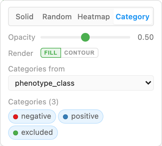
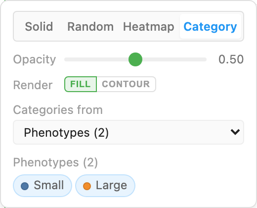
Use the column when your analysis has already classified the objects. Build groups when it has not, or when you want to try a cut-off and move it. Switching between the two costs nothing, and your groups stay defined while you look at a column.
The canvas legend
Whenever any color viz is active (heatmap, category, or phenotype), a legend card appears above the scale bar in the bottom-right. It's read-only. It exists so someone looking at the image understands what the colors mean.
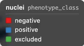
Multiple labels can show legends at once: one card per label, stacked. Hidden labels' cards disappear automatically; toggle visibility via the  icon on the label row to control the overlay.
Persistence
Analytics data, visualizations, filters, and phenotypes all persist to the browser's IndexedDB, keyed by the image's ZARR URL / local folder handle. Reload the page, reopen the image. Your CSV is still loaded, your heatmap is still active, your phenotypes are still in place.
The URL query string encodes channel + zoom + selection state, but not analytics data itself (CSVs can be large). The URL is enough to navigate back to your view; the local browser handles the CSV.
Mobile
Analytics and phenotype sections are hidden on phone-width viewports. The underlying reason: local CSV selection requires the Chrome/Edge File System Access API, which isn't available on mobile. Tablets show the full desktop UI.
URL-based analytics (the HTTPS-hosted roadmap item) will unblock phone viewing of pre-built phenotype configurations. Once shipped, mobile users will be able to receive a shared link and see the phenotype-coloured view, just without the ability to tweak the CSV.
Gotchas
Object-ID alignment. CSVs from different tools start counting from different bases. CellProfiler's ObjectNumber is 1-based, QuPath's detection IDs are often hash-style, napari's label_id matches the underlying regionprops convention. If objects aren't coloring at all after load, open the info modal and check: the detected object-ID column should match your label's pixel values.
String columns with > 500 unique values are truncated for performance. Category coloring still works, but the legend caps at 12 rows.
Mixed-type columns. If any cell parses as string, the whole column is treated as string. You can't heatmap a column that accidentally has "NA" sprinkled through numeric values; clean up exports or filter first.
Hidden labels don't contribute a legend card. If the legend isn't appearing, check that the label is visible ( icon on the label row). We treat hidden labels as "the user doesn't want this on screen" and skip the legend card accordingly.
Image credits
The screenshots on this page use a public high-content screen, with segmentation and measurements we produced from it. See Sample Data and Credits.
Related guides
- Annotations: annotate regions of interest on top of the same image
- Sharing Views: URL state captures the current view for reviewer handoff